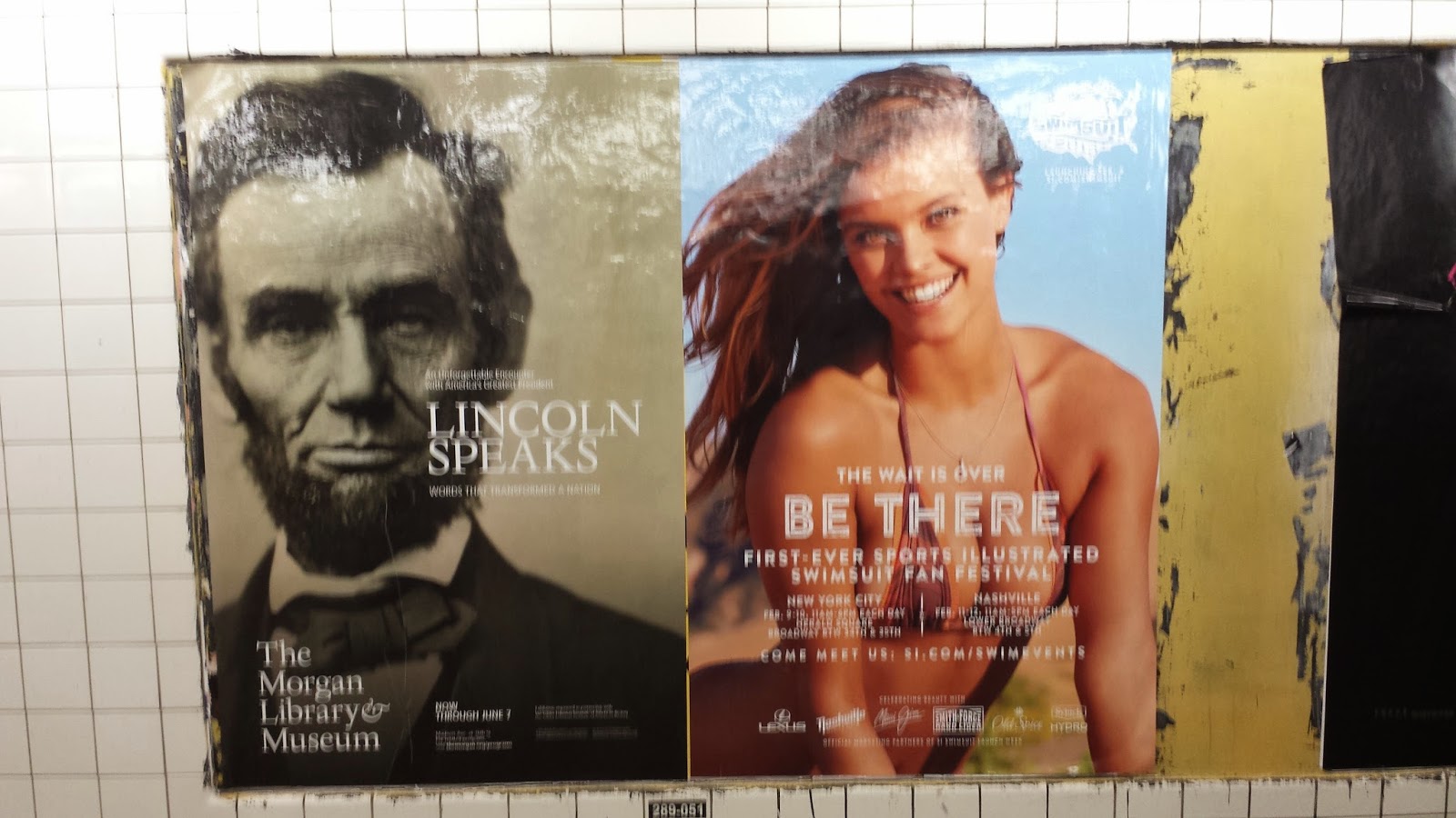
I've been seeing these posters lately, mainly along the G Train line. As my train passes by these stations, Abe Lincoln's got a new babe on his arm. Now was this commissioned or...?
G Train at Bedford Nostrand

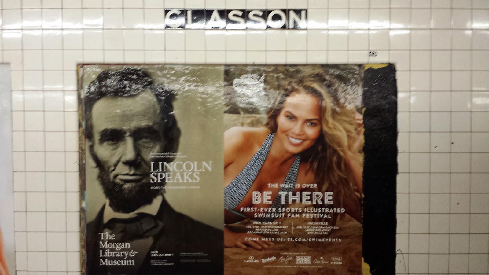
G Train at Classon

G Train at Clinton-Washington
G Train at Classon

G Train at Clinton-Washington
Title: Unknown
Artist's Medium: (2) side-by-side ink prints on overlaminate, approximately H42" x L26" ea.
Subject: The first poster conveys an achromatic photograph portrait of a man in a suit. He is looking into the camera at the viewer; he has bushy eyebrows, a beard, and a short haircut that is parted to the side. Spoiler alert: this is a photo of President Abraham Lincoln. The background is blank, and his portrait takes up 2/3 of the composition. The second family of posters conveys a color photograph of a woman who is scantily clad in a bikini. Each version slightly varies, but all in all, the woman in the composition has beachy waves and is staring into the camera with her bedroom eyes, and referring back to the Lincoln poster, I swear those are his bedroom eyes as well.
Objects: There are two main titles in the first poster. Capitalized, white letters are placed to the right of Mr. President's mouth, as if he is speaking, the text reads, "LINCOLN SPEAKS." Verrrrry clever. Then there is white text placed at the bottom left corner that reads, "The Morgan Library & Museum." There is no cleverness in this placement, it's purely informational. Amongst the second poster, a logo lives somewhere in the compositon of the Sports Illustrated family. This is a fairly interesting logo and the family of text also has promise, but it's all lost in boobs. It took me a few weeks to notice these posters even said anything, and unfortunately, once I got around to looking past the boobs and reading the text, I had missed the Sports Illustrated event it was originally advertising.
Lezzgetintoit: So how many historians are gonna bash me for this one? Yes, I took A.P. US History in high school. I know that Abe was our 16th president who served during the American Civil War and advocated the end of slavery in such a way that we don't have to live with black people but we can just ship them back to Africa or just to Central America. I know that he was not the president who died of an overindulgence of milk and cherries. I know Dale Carnegie had a real liking towards this guy. I know all of these things, and I didn't even have to watch 2012's Lincoln or that other one where Abe hunts vampires. For the record, I didn't watch those movies because I know how they all end: he gets shot.
I see why these images were pasted side-by-side—it's because these ad companies saw no reason to purchase a whole spot, because are these events really that important? However, when I see this composition, what I really wonder is: did these two advertising companies get together and design these in tandem? There are so many similarities between the two posters, for instance, both depict a human that just stare straight into your soul. Okay, that's only one similarity, but think one was designed in sacrifice to support the other. Because the text in the swimsuit poster is illegible on account of boobs, the swimsuit poster, out of the kindness of its heart, forfeited the quality of its advertising content in order to make Lincoln's event look smashing. So as always, Woman saves the day. You're welcome, Abe.
