Saturday, March 5, 2016

The Annual Update 2016

I don't do much with my life, here's a short list:

-Sleep
-Work
-Eat
-Wait for someone to invite me out
-Accept
-Realize I will have to wait for a subway train during the weekend schedule
-Immediately regret my decisions but not flake out

Another thing I actually do with my life is I don't finish anything. I have a bin of untouched art supplies, patches of clothes that lay dormant in my closet with needles dangerously nested somewhere in there (most likely in crotch areas), year old oatmeal I'd been planning to eat for breakfast at some point, and this blog. Actually, that's a lie, blogs don't generally have a finish date; let's just say I set up a schedule to annually update this shit.

I have great direction in life too. This blog started out as a travel blog. When I realized that the only traveling I do is moving to New York City, I thought, "Let's get New Yorker about this. Let's get so New York about this that if you could smell this blog, it'd smell of urine so potent you have to look down at yourself to confirm you didn't wet yourself (this happened to me on an E Train platform, I swear)." The first post of this kind was a hit, and then a so-so second post, and then I neglected my responsibilities to the blogging community for a year, and for that, I apologize. I'm sorry.  

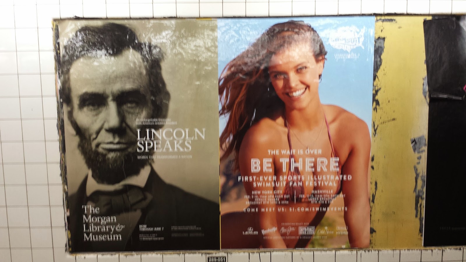
So lezzgetintoit: There is no better reminder of my redeeming qualities than this ad that has been pasting it's way onto subway platforms and all other modes of public transportation lately. I first saw this on a double-decker tour bus. Not only was I already ticked off walking out onto the street and feeling like a zoo animal with all of the the happy tourists looking down and pointing at me, but I saw this ad and felt worse:

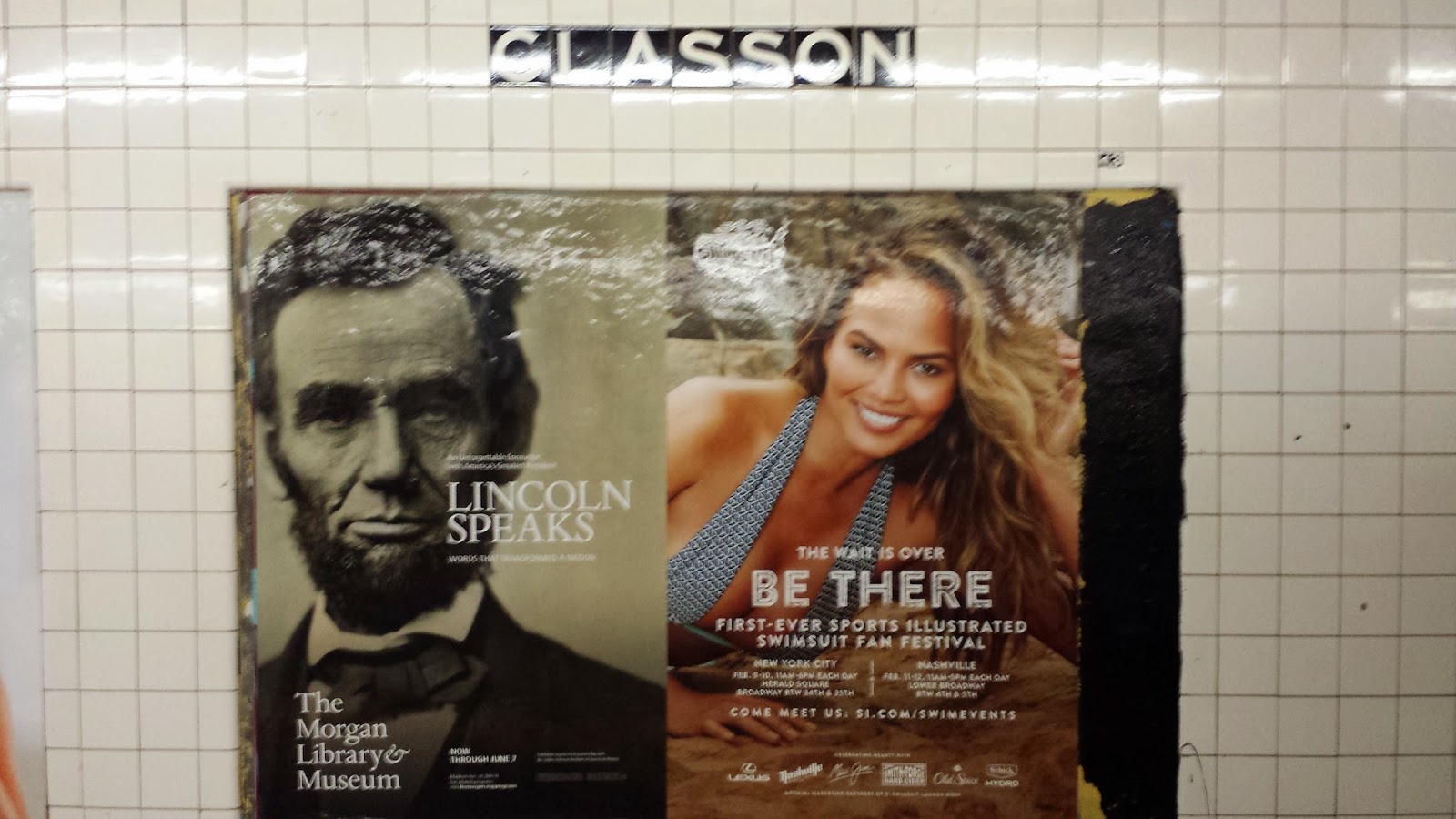
First seen on a tour bus, next seen off of the G Train, Bedford-Nostrand platform

First, the technical stuff, then I'll explain:

Artist's name: Unknown
Title: The Catch
Artist's Medium: Ink print on overlaminate, approximately H46" x L60" (printed in various other sizes as well)
Subject: Focal point set in the center of the composition. There is a woman in the middle ground and a man in the background, both are wearing black, both are making eyes at me. The background is solid red, and the title "The Catch" is set diagonally in the center foreground. White lines continue from the title and appear to continue past the borders of the composition. 
Analysis: The juxtaposition between 3-dimensional and 2-dimensional elements is most noticeable where the man is intertwined between the white lines extending from the title. The subjects are well dressed. Maybe they are spies or criminals; I would have no clue. I don't have standard TV channels and have not seen any previews, but the ABC7 logo allows me to safely assume that this is a TV show. 
Interpretation: I see this poster, I see Peter Krause. It's only half his face and half his body, but it's him; the poster says so. He brings back a wave of recent memories. I spent some months in 2015 on Netflix watching Gilmore Girls and finishing the series because I never did when the show was in progress (not my fault seasons 4-7 sucked). I remember not what the last Gilmore Girls episode was about, but what began automatically playing after the episode finished. I was cooking dinner, and the Netflix timer was counting down. After 30 seconds, this show called Parenthood would automatically begin. My chicken was burning, my salad was wilting, I had no time to grab the remote and find something else so I let it play, and that was it. I was hooked.
No spoilers, but I spent the next few months watching someone get diagnosed with autism, someone who couldn't keep a man (spoiler: Lauren Graham), and someone who lost their job at the shoe business with the dark office that looked like the lights were never on. There's a brunch spot/bar in Williamsburg, Brooklyn called The Luncheonette; I thought it was a recording studio (you'd know if you watched Parenthood). 
I was getting obsessed, but suddenly, I hit a wall. For those who don't know, Peter Krause is a main character in Parenthood. I made it 7/8 of the way through season 5, the second-to-last season, and I still haven't finished the series to this day; actually, I forgot that I never finished it. I just abandoned the show like a mother dropping off a 17 year old "child" on the steps of a fire station. Walking out onto the street that fateful day and running into Peter Krause like that reminded me of the TV show and set off a Rube Goldberg of different things I never finished. So now here I am, on a Saturday night, chillin' in my mumu and reflecting on all the things I never finished; also really dreading that subway train trek I have to take on the weekend schedule because I made previous engagements. 


Sunday, March 8, 2015

All-American

I've been seeing these posters lately, mainly along the G Train line. As my train passes by these stations, Abe Lincoln's got a new babe on his arm. Now was this commissioned or...?

G Train at Bedford Nostrand

G Train at Classon


G Train at Clinton-Washington

G Train at Classon

G Train at Clinton-Washington 

Artist's name: Unknown

Title: Unknown

Artist's Medium: (2) side-by-side ink prints on overlaminate, approximately H42" x L26" ea.

Subject: The first poster conveys an achromatic photograph portrait of a man in a suit. He is looking into the camera at the viewer; he has bushy eyebrows, a beard, and a short haircut that is parted to the side. Spoiler alert: this is a photo of President Abraham Lincoln. The background is blank, and his portrait takes up 2/3 of the composition. The second family of posters conveys a color photograph of a woman who is scantily clad in a bikini. Each version slightly varies, but all in all, the woman in the composition has beachy waves and is staring into the camera with her bedroom eyes, and referring back to the Lincoln poster, I swear those are his bedroom eyes as well.

Objects: There are two main titles in the first poster. Capitalized, white letters are placed to the right of Mr. President's mouth, as if he is speaking, the text reads, "LINCOLN SPEAKS."  Verrrrry clever. Then there is white text placed at the bottom left corner that reads, "The Morgan Library & Museum." There is no cleverness in this placement, it's purely informational. Amongst the second poster, a logo lives somewhere in the compositon of the Sports Illustrated family. This is a fairly interesting logo and the family of text also has promise, but it's all lost in boobs. It took me a few weeks to notice these posters even said anything, and unfortunately, once I got around to looking past the boobs and reading the text, I had missed the Sports Illustrated event it was originally advertising.  

Lezzgetintoit: So how many historians are gonna bash me for this one? Yes, I took A.P. US History in high school. I know that Abe was our 16th president who served during the American Civil War and advocated the end of slavery in such a way that we don't have to live with black people but we can just ship them back to Africa or just to Central America. I know that he was not the president who died of an overindulgence of milk and cherries. I know Dale Carnegie had a real liking towards this guy. I know all of these things, and I didn't even have to watch 2012's Lincoln or that other one where Abe hunts vampires. For the record, I didn't watch those movies because I know how they all end: he gets shot.

I see why these images were pasted side-by-side—it's because these ad companies saw no reason to purchase a whole spot, because are these events really that important? However, when I see this composition, what I really wonder is: did these two advertising companies get together and design these in tandem? There are so many similarities between the two posters, for instance, both depict a human that just stare straight into your soul.  Okay, that's only one similarity, but think one was designed in sacrifice to support the other. Because the text in the swimsuit poster is illegible on account of boobs, the swimsuit poster, out of the kindness of its heart, forfeited the quality of its advertising content in order to make Lincoln's event look smashing. So as always, Woman saves the day. You're welcome, Abe.


Friday, February 27, 2015

Curious?

So I'm trying something new. Basically, I graduated from the Interior Design program at Arizona State University. Since then, I worked in the design field here and there, but that's not important. What's important is about 9 months ago, I booked it from Phoenix, AZ and moved to New York City, NY.

I'm definitely feeling like a grown-up here in the city. I'm living in an adult apartment, currently working an adult job in the design field, and to better my adult self without the motivation that school provides, I'm not doing a whole lot. It's winter right now, and it is icy. So I'm saving my brittle bones from breaking by not going jogging and slipping, I haven't been waking up early enough to hit up the yoga classes before work, and winter is over soon so what's the point in joining a gym right now? I think these reasons make it safe to say that my body is going to shit, but that doesn't mean my mind goes down with it.

During my commutes to work via underground subway train, I am constantly surrounded by printed ads. These are pasted all around the station platforms and posted in every subway car. I find myself spending the majority of my time waiting for the train walking up and down the platforms examining the ads as if I were in a museum. And you know what? These are works of art, and I'm going to start analyzing these ads and writing about them. This exercise helps me to keep writing and thinking, and it helps me to strengthen my design dialogue skills when I'm not paying a school to make me do these things. I'm also doing you, the audience, a service. You get to see New York City through a different lense, you get to keep your reading skills on point, and you get to keep being entertained by things on the internet.

First subject: 50 Shades of Grey ad collection. I've never read the books, and I've not seen the movie so I know nothing about this franchise besides what I've overheard my friends discuss. From what I've heard, this is a tender love story based on sexual bondage, and the movie is basically a softcore porn. I'm almost traumatized that I found out my parents went to see it. Alright, let's have some fun:


Artist's name: Unknown

Title: Fifty Shades of Grey 01

Artist's Medium: Ink print on overlaminate, approximately H46" x L60"

Subject: There is a male figure in the center of the composition staring out of  a window onto the view of a city. Based on the perspective of the view, this man is inside of a skyscraper building. The composition is achromatic with the exception of red text.

Objects: Objects in the piece include floorspace in the foreground that reflects window mullions in the middleground, and a city skyline is shown in the background. There is also center-aligned, capitalized text in the composition. The largest text is a phrase in black letters that reads "MR. GREY WILL SEE YOU NOW." This is italicized text with serifs, and it sits towards the top of the composition. Medium-sized text in the same font as the previously stated phrase reads in capitalized black letters,  "FIFTY SHADES OF GREY." This text is not italicized,  and it is placed towards the bottom of the composition. Below this text reads "VALENTINE'S DAY." this is the smallest font in red, san-serif text.

Lezzgetintoit: I get the impression that this is a commercial office space—possibly a private office. Based on that notion and his suit attire, this man may be a powerful business man, but the first thing I really notice is the emptiness of the room. He may be a powerful business man, but he is alone, and based on pop culture news and what my horny friends told me about this plot, this man is alone and lonely ifyaknowwhatImean. 


Artist's name: Unknown

Title: Fifty Shades of Grey 02

Artist's Medium: Ink print on overlaminate, approximately H46" x L60"

Subject: The scene is focused on a female and a male. They are smooshed against the left side of the composition against an implied wall. The female's arms are positioned above her head, her eyes are closed, and her mouth is slightly ajar. The male's left hand is in her hair, BUT WHERE DAT RIGHT HAND AT? His eyes are closed as well, and he is wearing a long-sleeved shirt. Their faces are touching—all but their lips. The image is achromatic with the exception of red letters.

Objects: There are no objects in the composition. The subject matter vignettes into black darkness. The text is center-aligned, vertically organized leading the eyes from the top to the bottom, and all letters are capitalized; this is placed on the right side of the composition. The first phrase in small, white text in san-serif letters read, "THE WORLDWIDE PHENOMENON COMES TO LIFE." Below that, the largest text depicts words that read, "FIFTY SHADES OF GREY." These letters have serifs, and each word in this title alternates from white to grey text. Below the title, medium-sized, red text in a san-serif font identical to the first phrase reads, "VALENTINE'S DAY,"

Lezzgetintoit: The word" life" is in the poster so the subject matter definitely needs to look alive. My impression is that these two are in a fit of passion. I definitely feel like I walked in on two people vigorously making out and they ain't about to stop just because I caught them; this is just bad PDA manners. The powerful businessman from version 01 of the series feels comfortable with this lady by the look of the proximity of their faces, but also because he feels he can dress down in a long-sleeved T-shirt when he's with her. Based on what my horny friends told me about this story, I figure the lady's hands are tied above her head so she can't really say no to his smooches, but by the look on her face, she's sayin' YUSSS. 


Artist's name: Unknown

Title: Fifty Shades of Grey 03

Medium: Ink print on overlaminate, approximately H46" x L60"

Subject: The composition is equally balanced; half of it is white and half of it is black. This is focused on a woman and a man. The woman is lying down in the foreground of the white half; her heads is turned and gazing towards the viewer. The man is standing in the foreground of the black half; he is directly facing the viewer with his nose and mouth shown, but his eyes are cut from the composition. The composition is achromatic with the exception of red text.

Objects: There is an object in the piece in full view. This is a tie that is wrapped around the man's hand. There is also diagonally organized text with a word in the top-left corner and a title in the bottom-right corner of the composition. The words are center-aligned, and all letters are capitalized. The largest text appears on the white side in the top-left corner. This text is in black with serifs reading: "CURIOUS?" Medium-size text in the bottom right corner is in white with serifs reading, " "FIFTY SHADES OF GREY." Below the title, small, red san-serif text reads "Valentine's Day."

Lezzgetintoit: The differences between the woman and the man in this composition are black and white. ← Get it? Because the woman is in the white side and the man is in the black side? Yeah? Yeah? Well anyways, I see cushions and I gather this woman is laying on a bed or some kind of comfortable horizontal surface. Shes' wearing comfy clothes; she's lounging, relaxed, and she looks satisfied. If I didn't take a second look, it almost looks like she's holding a cigar. *wink wink* Either that, or she has some kind of inviting look in her eyes. The man has his suit on, but it looks a bit rustled; the top button is not buttoned and he doesn't have his tie on. This guy also has a hint of a smirk on his face? What's this smug bitch thinking? I'm left wondering if something just happened between the two of them or if something is about to happen. Did they just eat their Chinese takeout and she's fat and happy? Are they about to go out to have a Chinese food dinner, but she's still getting ready? CURIOUS? Like hell I am. I need to know about the status of this Chinese food meal.


All in all, I think this series of advertisements was well executed. The posters are aesthetically related in that the fonts are consistent, and they are all achromatic with the red "Valentine's Day" text. I really was going to see this movie on Valentine's Day with a Valentine's Day all-girl power group, but instead, I decided to visit Washington D.C. It was for the best because you won't like me when I'm hot and bothered, but I digress. This ad collection is also thematically consistent; if you experience the collection from 1-3 as I did, they seem to follow an ambiguous storyline and order of events. This draws the viewer in with intrigue as well as tension—what a tease.

Monday, July 15, 2013

It's Not Goodbye, It's See You Later

Is that from a movie? It is. I looked it up right after I titled this post. And I'm leaving it.

I'm never good at concluding these things. I'll do it later. Like when I actually conclude my time in Thailand. This Friday. Thailand Time. The last few days didn't mean anything (I didn't mean that) since I'm too lazy to upload pictures or tell any stories. So until I get un-lazy:

Teaser. Sweaty teaser. In Ayutthaya.

Thursday, July 11, 2013

the NOOOOOOOrth

Things I don't have photos of:

-The baby duckling dying in my hands because of its handicapped neck.
-The 5 chickens that were drained of their blood then dipped in boiling water and plucked of their feathers.
-The self-sufficient girls farming plants, raising animals, cooking animals, cleaning bathrooms, doing laundry, going to school, and  running this institution because their families in the hilltribes can't keep them.

What I do have pictures of:

The nun who looks after the girls at this place.
(whatever the place is)

The other nun who looks after the girls at this place.
(whatever the place is)

The chickens we stole eggs from.

And then completely unrelated to this all-girls farm/boarding school where we stayed last night:

-In somewhat reverse chronological order over the course of a week or so.


Wat Tilok Aram in Phayao

The  ride to Wat Tilok Aram

Uncle on the  ride to Wat Tilok Aram

 
Soymilk. Yay. Awesome. Hooray. Fun.

Oh no. Reminders of what I'll be crying over 
when I return to the States.

And then ridiculous instructions to open.

This Lady loading 5 kilos of pineapples in the truck

Soup in a coconut.

Green dessert.

Onward to Burma! 
(Except my American Passport doesn't allow me)

The Northern Most of Thailand needs an arch, of course.

This image labeled itself.

A Thai finial with the patch of land on the left being Burma,
the patch of land on the right being Laos. 
It all looks the same, really.

The Golden Triangle: yay for opium.

Plate in the foreground: mushrooms.
The plate in the background: fried tiny fish.
You just eat the whole damn thing, head, and eyes, and all.
I COULDN'T.

Fish cakes.
I COULD.
I DID.

FROOT

Original Redbull

Rice fields

Zucchini

Farmers

Jack Fruit

Views

Hill dogs

Hill dog

Rice farm baby.

Children's camp-dinner

Children's camp-beverage


Children's camp-dinner

A loom

A waterfall

More views.

A temple

Grapes and family

Pickin' grapes.

I want to adopt the child on the left.

Riding elephants

Riding elephants

Elephants

Elephant.

Hill children